
How can you improve the user experience of your website? If you understand heat maps and what they mean, you’ll know where to look.
Heat maps are a graphical representation of user activity on your website or app. The color-coded values are used to compare various elements and identify trends. This means the various colors can show you where users are going on your website and when they exit the site in order to find opportunities to improve your site and the website performance and experience for your users.
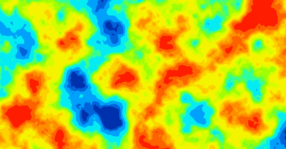
Where are your visitors focused?
There are several types of heat maps that can help you understand user behavior on your site. All of them provide visual data that tells you where visitors focus their attention when they visit a page. This means you can identify areas in which users are engaging with your site and areas they tend to avoid. This means you’ll want to focus your attention on improving some aspects of your site to bring attention to areas that aren’t gaining as much engagement or keep important information in front of the user in areas they interact the most with your site.
What are some key benefits?
Some of the benefits of this type of data analysis are:
- Visualize web page or product usage data to spot patterns and trends
- Track user engagement in-app across the whole customer journey to identify drop-off points and areas lacking engagement
- See if the user interacts with key page elements to adjust marketing messages and drive conversions
Using this data analysis, you’ll have a much better understanding of why some elements of your web pages receive high levels of engagement while others are basically ignored.
Why is heat map data analysis important?
Reviewing heat maps might look like nothing more than a cool radar that looks a lot like your weather app, but there’s much more to it than that. It’s important to use this type of data analysis for many reasons:
Evaluate customers’ in-app interactions with products
What products are customers reviewing? Are they looking at a few products exclusively or checking out everything you have to offer? Some customers only see the featured products and never understand the value of the features offered or some of the associated products that could be extremely beneficial to them. It’s important to identify which areas of your site aren’t being seen or interacted with.
Drop-off reasons
Why are users dropping off from your site? Heat maps can tell you where most users drop off, giving you an idea of the reasons behind these changes. Some of the reasons that users leave your site and go to other sites can be:
- Bad product design
- Technical errors
- A lack of onboarding
- A user path differs from the predefined one
High drop-off rates among new users might require a checklist to follow their experience and understand why they might choose to leave your site.
Improve user experience based on real data
The data provided by these reports allows you to understand the behaviors of users visiting your site. This means you can use data analysis to understand better how users interact with your site and allows you to see where they haven’t finished interacting with your site and products. Some users navigate back and forth between products to compare them, while others might drop off in the middle of the process. Heat maps help identify these patterns and give you an idea of what you need to do to improve your site to provide a better user experience.
What’s the best way to analyze this data?
Using a four-step process, you can make data-driven decisions based on your heat map and what it tells you. These steps can be applied separately or combined, depending on the purpose.
Product analytics
Is the product a good product? Why are users shying away from your featured products and moving on? Don’t rely simply on heat maps to tell you whether or not the products need to be changed; perform a product analysis and understand the quality of the products offered.
A/B testing
Many marketing experts use a two-pronged, or A/B testing process to see which performs better. You can absolutely test your call-to-action buttons or new feature designs using this process to see what users respond to.
Customer segmentation
If you have or users segmented then you can look at various heat maps and understand how each segment responds to your website, products, and features. This can be extremely useful, especially when you want to target a specific segment of your customer base.
Track dead clicks
When customers click on some buttons but don’t perform any actions, these are dead clicks. This could mean your users aren’t finding what they are looking for, and it can be fixed with button moves, tours, and messages.
How will you use heat maps to help you improve the user experience on your website?
This post may contain affiliate links. Meaning a commission is given should you decide to make a purchase through these links, at no cost to you. All products shown are researched and tested to give an accurate review for you.